While going through some post tonight, I got a notification pop up, informing of the need to refresh my page so as to view the @peakd latest update, which I did immediately and I most confess, I love it already.

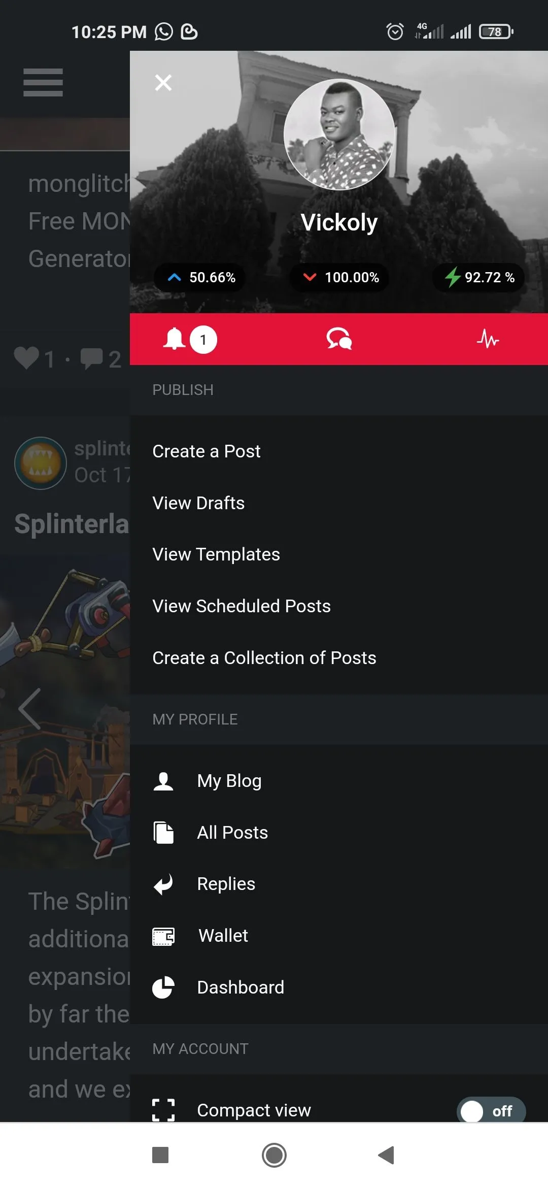
The new layout is super gorgeous and attractive, details about your account is aline to the right, so once you click on your profile picture, a tray slide will appear, where you can choose to either create post, view draft, check wallet and everything related to your personal account will pop up.

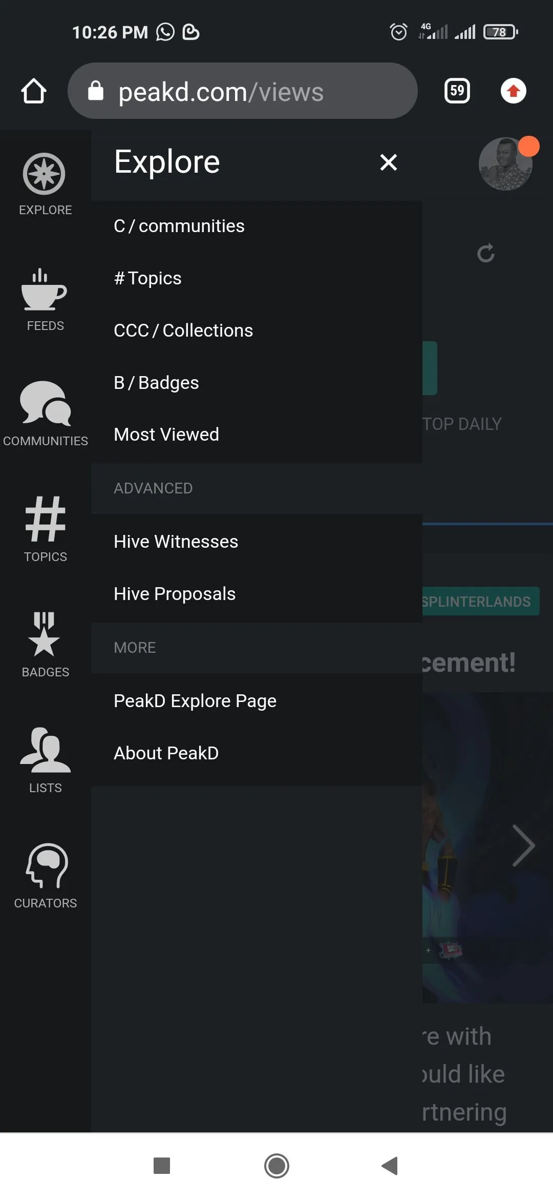
And to the left, once you click on the three line, info about hive blockchain slide will appear, and you will see options like fields, community, topic, witness, proposal and co will pop up.

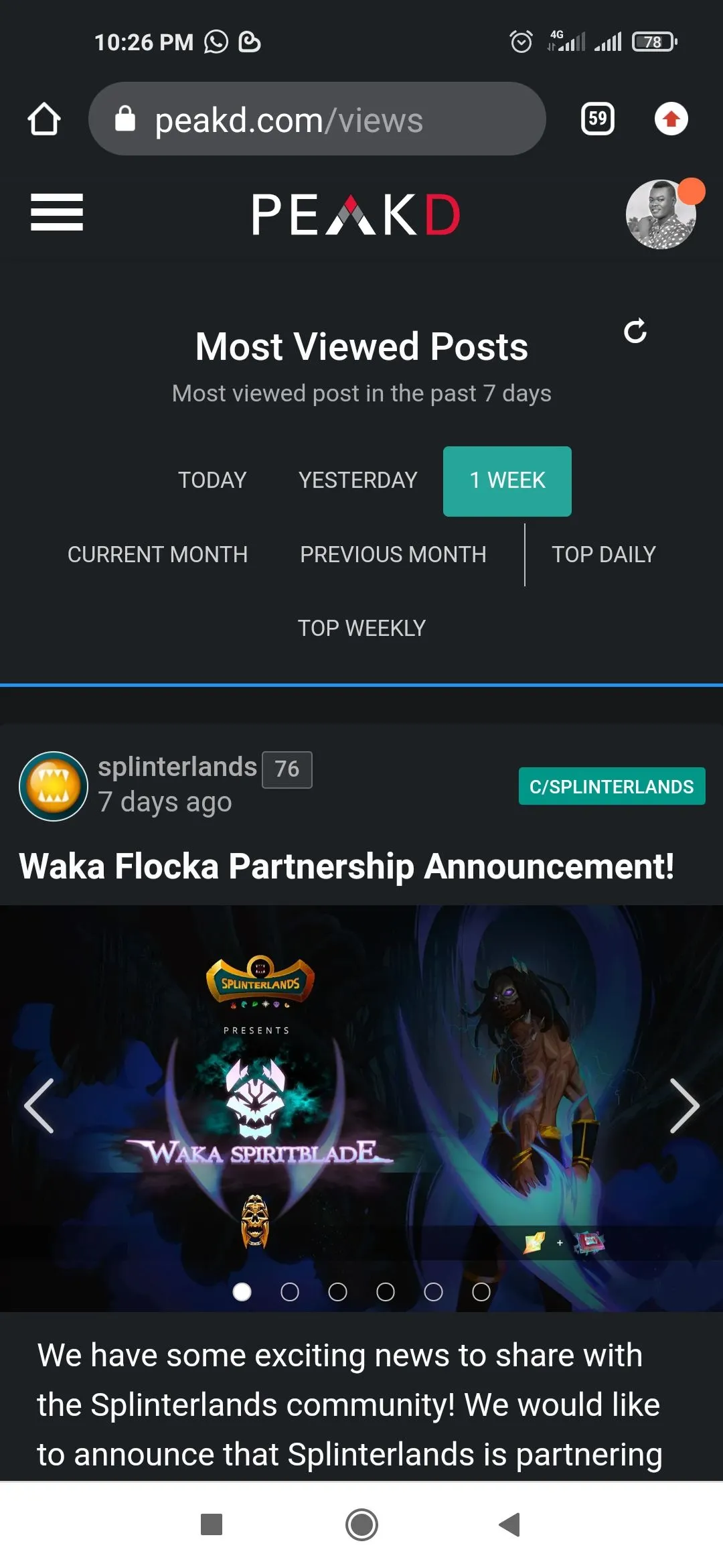
Another thing I notice is that theirs an update where you get to see the most viewed post of the day, week or month(am not sure this is in the previous version, because I never came across it before).

I'll encourage everyone to check it out, am sure you'll get love it and thereby get engrossed to it like I do.
Return from REVIEW: I AM LOVING THE NEW PEAKD INTERFACE UPDATE to vickoly's Web3 Blog

